Mobile APP startup

AidMate.


by Project DockYo


“Because it proves you don’t need to change the world for the better. You can start with the most ordinary ingredients. You can start with the world you’ve got.”

Catherine Ryan Hyde,
Pay It Forward


STARTING LINE

A NEW KIND OF SOCIAL NETWORK

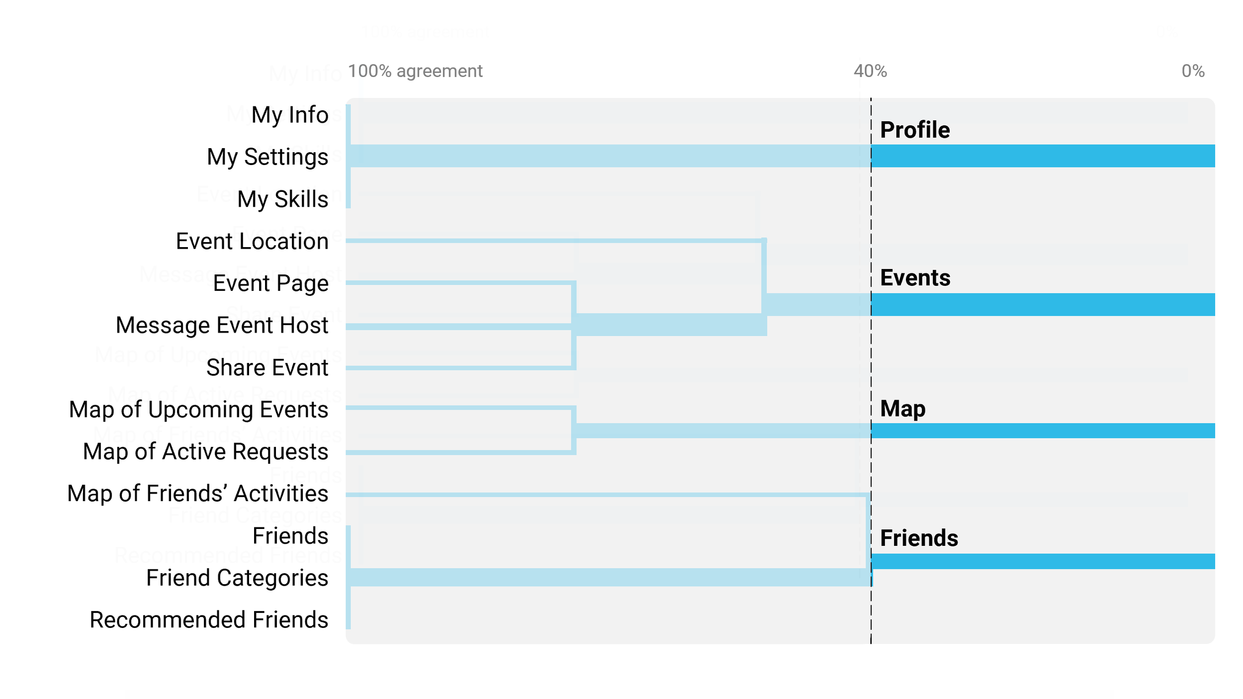
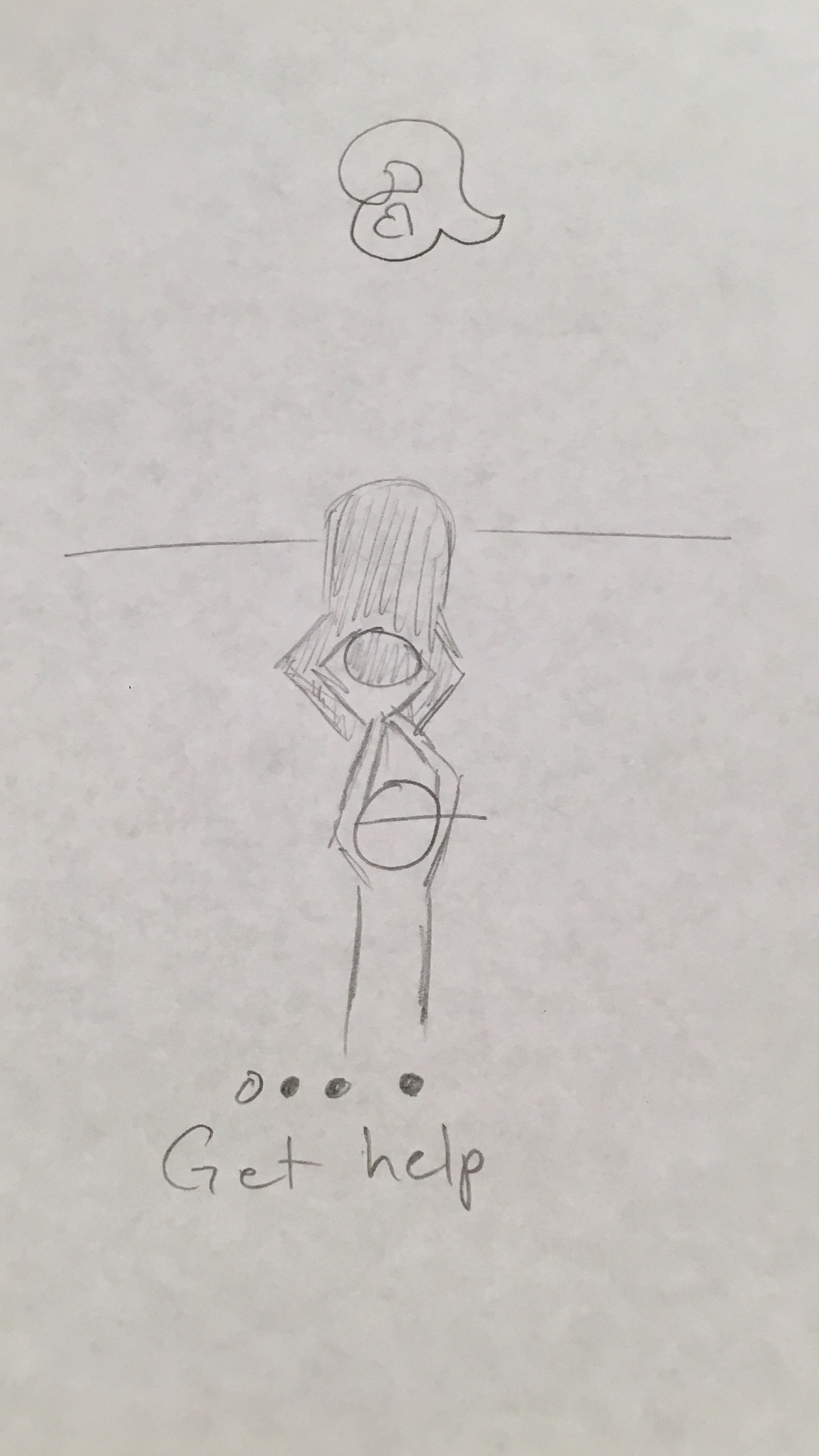
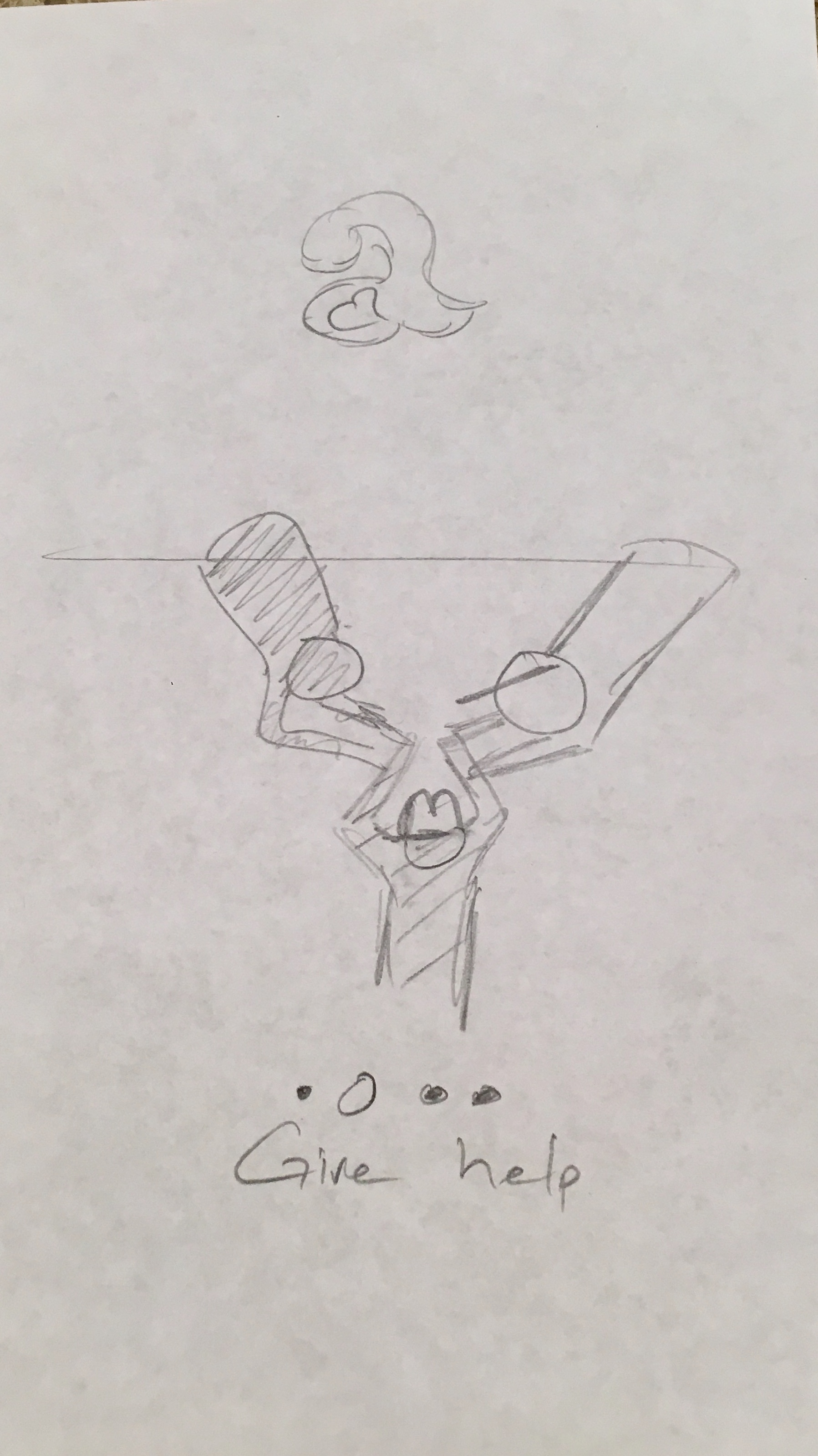
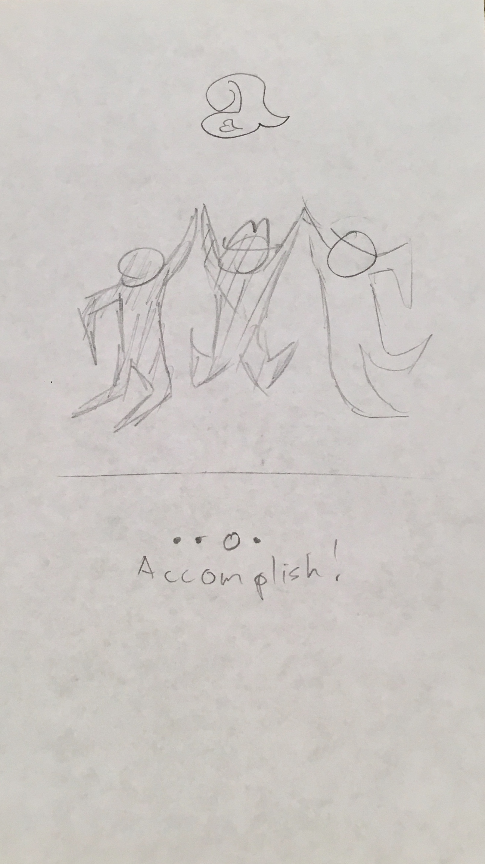
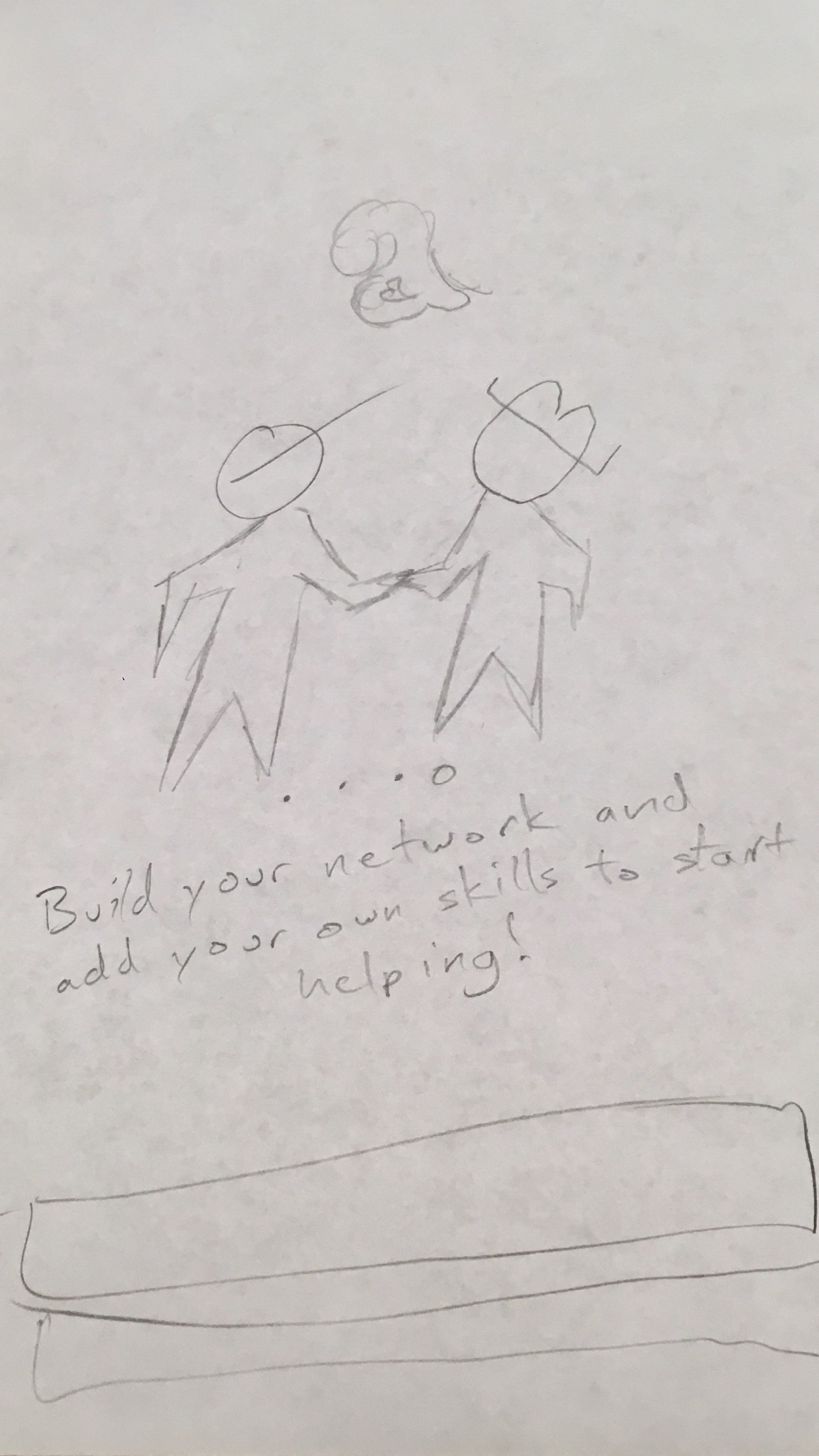
AidMate is a mobile app designed by the AGILE team, Project Dock Yo. The Project Dock Yo startup team had the goal of creating an app that would utilize a user's already existing social network to find and create groups for upcoming projects, whether you're creating a website next month, moving apartments next week, or really need to jumpstart your car right now.

An AGILE Team

MY ROLE

I was initially brought on as a graphic designer early in the app’s development. As I became more involved in the project, my duties expanded to include more UX and UI as the team’s Lead Designer.


Read on for a full review of the AidMate Design Process.


THE PROBLEM

People need a way to utilize their existing social network to aid each other in the struggles of everyday life.

These days, everyone is connected through social networking sites like Facebook, Twitter, Instagram, SnapChat, and so many more. However, there is not a quick, simple way to leverage your existing networks into an actionable way to solve everyday problems.

THE SOLUTION

A New Way to Aid Others

Give Help

  1. Log your personal abilities and skills.

  2. Receive a notification if your friend needs help with a task you’re good at.

  3. Aid your friend!

Get Help

  1. Request help and specify the type of help you need.

  2. Friends with matching skill sets are notified.

  3. Receive aid from your friend!

The Process

1. Discover 2. Define 3. Develop 4. Deliver


Step 1

Discover


INTERVIEWS

Understanding the Issues

Through user interviews, we honed in on exactly what are goals were. Everyone was able to recall a time when they had received help, with no promise of a reward. Often these instances were years ago, but had left such a strong impact that years later, people could recount their stories in vivid detail.

Each time this 💩 happened, I was disgusted with how people would not bother to help. I spent hours on the side of the freeway watching vehicles blow past me.


I am sure it won’t be as meaningful to anyone else, but it was seriously the highlight of my 2010.


STEP 2

Define

USER PERSONA

CRAFTING A HUMAN-CENTERED DESIGN

Understanding who we’re designing for. What are they’re behaviors? What do they need? What are they trying to accomplish?

Jack is in his mid-20s, hangs out with close friends about twice a week, and enjoys helping people.

However, he often feels like a burden whenever he asks his friends for help.


 PROBLEM STATEMENT REFINEMENT

Making It Personal

With the goal of keeping a user-centric model in mind, it was time to refine our initial problem statement.

Jack needs a way to ask for help without feeling like a burden,
because while he has many skills to offer, he can’t do everything by himself.


Step 3

Develop

CARD SORT

Dendrogram

Once Key Features and Pages within the app were locked down, users were asked to sort them into whatever categories they felt made the most sense to them. 4 distinct categories were apparent as highlighted in the dendrogram above.

Taking those categories as the most important pages within the app, a sitemap was created.

SITE MAP

INFORMATION ARCHITECTURE

The Site Map was drawn up as a direct translation of the data gathered in the Card Sort to create an intuitive and easy to navigate application.

NAVIGATION BAR

GETTING AROUND EASILY

The easiest and clearest way to navigate through the app.

4 icons total, one for each of the categories from the Card Sort Activity, plus a central button for the app’s key action.

PAPER PROTOTYPE

EARLY STAGES OF USABILITY TESTING

Quick. Efficient. Feedback on overall design direction from real users in minutes.

Testing agreed with the initial research from the Card Sort; the Navigation Bar was found to be an intuitive way to organize the the app’s content.

However, users needed more context for how to use the app to fullest.

EARLY FEEDBACK

MAKING ADJUSTMENTS

Onboarding screens were drawn up, sent through a second round of testing, and then later incorporated into the Low-Fidelity Wireframes giving users a better sense of purpose when using the app for the first time.


LOW FIDELITY PROTOTYPING

MOVING UP IN FIDELITY

With the data in from the paper prototype, it was time to boot up Sketch and move the app into Low Fidelity.


MORE FEEDBACK

MEETING USER NEEDS

Another change here based on user feedback. Users were finding the broad ability to search for any skill far too daunting.

This screen was changed to instead also prompt a few recommendations for the user to select from as a less intimidating way to add skills to their profile.


HIGH FIDELITY PROTOTYPE

Fully Navigable & High Fidelity

Putting it all together, the final stage of the design process was to hand off the prototype to the team’s front end developer. Through testing and iterative design, AidMate had a strong foundation saving the team’s developer significant amounts of time coding the initial release.


Next steps for AidMate

Paying It Forward


3rd Party Login

Wider Webs

Use of 3rd Party profiles (Facebook/ Google) to quickly login a user and import their existing social networks.

Study on Help Categories

Beyond Help

Research on what are the niche fields that users are experts in and which fields are in high demand for core user base.

Reward System Gamified

+10pts

Potential to introduce a reward system to encourage super users. Humble thank you message vs gamification vs payment.


AidMate Case Study - Portfolio (1).png
 

Thanks for Reading!