APP CONCEPT
Wanderer.
The offline Off-the-Grid companion.
Don’t let extortionate roaming plans and sluggish hostel wi-fi ruin your travel plans.
Don’t let extortionate roaming plans and sluggish hostel wi-fi ruin your travel plans.


Wanderer is an in-depth and ground-up User Experience Case Study for an offline Travel App. Set with the goal of solving common problems in the travel industry, Wanderer takes the issue of viewing your travel plans while abroad and offline from the initial problem refinement stage through to a high-fidelity prototype.
This was a personal passion project I took on. As a team of one, I was able to dive deep on the areas I felt had the greatest need.
View the high-fidelity prototype below or read on for a full review of the Wanderer Case Study & Design Process.

Traveling to remote places is exciting.
And while planning adventures to far-off places is fun, it can be frustrating not having access to your plans once you’re off your phone carrier’s network. Keep your preparation in your pocket
no matter where you are.

Many apps and sites exist to allow for fun and in-depth planning. However, they all require an internet connection, and often a strong one at that.


Store all your maps, bookmarks, plane tickets, and more in one convenient, data-friendly place while online. Then access your plans later anytime, anywhere. No internet connection required.


I spent all this time making sure I had packed all my technology…I was basically carrying around a metal brick.
I interviewed regular travelers to hone in on key problem areas and how people were currently solving them. I got a great story from someone I interviewed who walked me through his careful planning and packing routine only to end up carrying around what he called a metal brick.


Ask anyone and they’ll tell you the first thing they pack for a trip is their phone. Ask them something they’ve forgotten and they’ll all answer that at some point they forgot to pack their charger.
This was a very universal experience that set the tone for my project…
Step 1. Pack your phone & camera
Step 2. Forget your charger


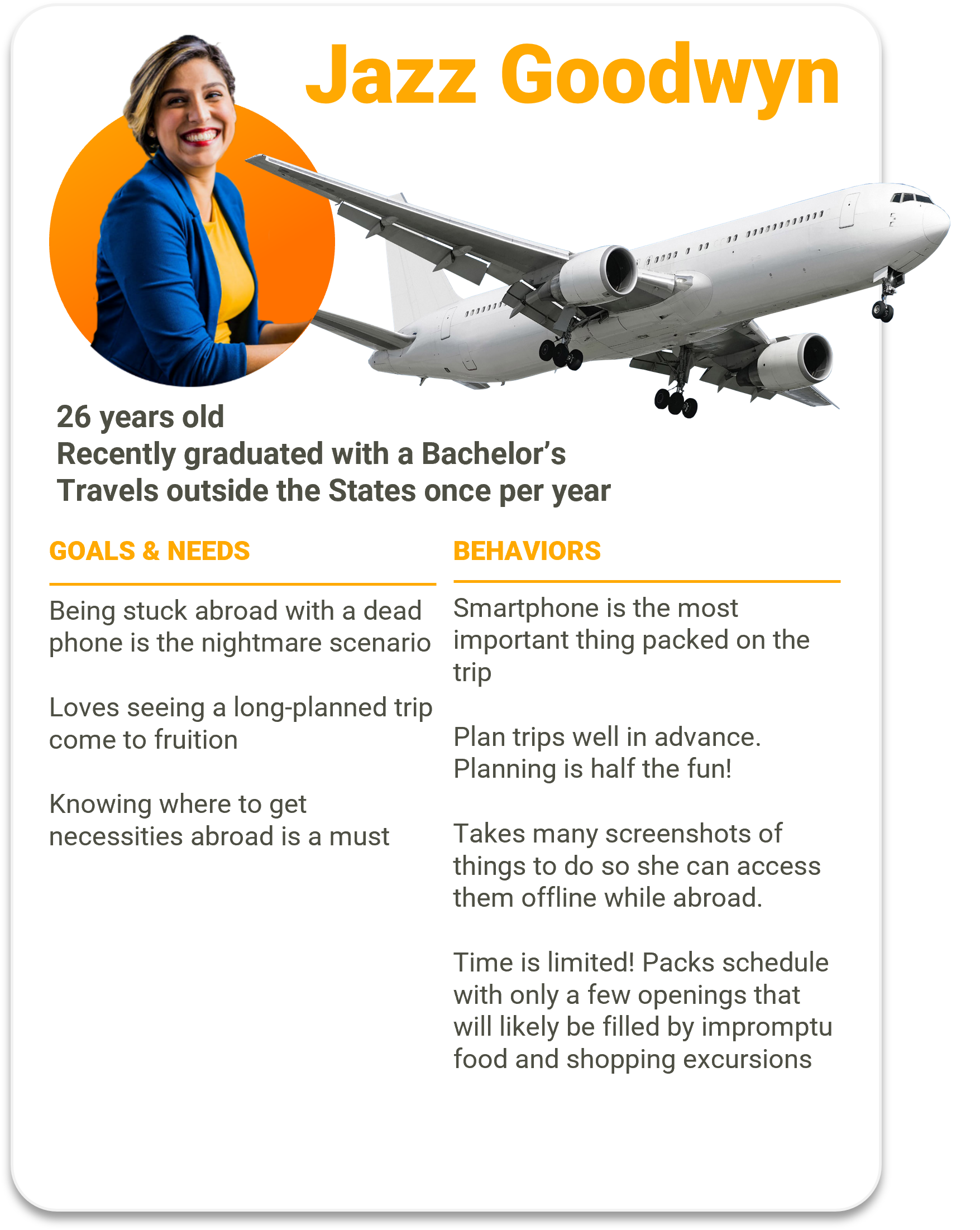
Jazz is in her mid-20s, tries to travel outside the U.S. at least once a year, and meticulously plans every minute of her trip.
However, all that planning becomes useless when her phone doesn’t have a signal.

With the goal of keeping a user-centric model in mind, it was time to refine our initial problem statement.
Jazz needs a way to access her travel plans while offline,
because she has limited internet access while traveling.


Early in the planning stage, I started comparing some of the other travel apps out there. Maps.me is great at its offline functionality. Especially, as the name implies, its maps.
Yahoo’s short-lived Radar app had a lot of really impressive features, but was seemingly discontinued shortly after launch due to its buggy interface and hamfisted AI Chat-bot Integration.
Syncing your planning stage with your maps is still untapped.

Screenshots
The biggest competitor.
And why not? They are quick, easy, and, most importantly, don’t require an internet connection.
However, they are also a major pain to try and keep organized, and there is no way you’ll get your destination’s directions, hours, and other important info all in one screen.

Every screenshot can take up to 3 MB of storage. Up to 11 MB if you’re an iPhone Plus user.
Meanwhile, a map of an entire city on Maps.Me is the same 11 MB as a single screenshot.

Well, in addition to organizing all that information in one convenient place, downloading all this data will actually SAVE you room on your phone leaving more room for pictures of your trip.

Less screenshots.
More selfies.

So I set to designing a rudimentary user flow that would gather all the information necessary from the user to download a MINIMAL amount of data while still being easy to jump quickly in and out of.


From the earliest sketches I prototyped, I wanted to really dial in on features that testers enjoyed while buffing out anything that hindered their progression through the app.

“Make It Bigger.”
One that surprised me was how consistently users vocally appreciated the bubble that confirmed how much storage would be remaining on their phone after they download their trip.

As I moved from a paper prototype to a low fidelity wireframe and finally up to higher fidelity,…

…I made sure to keep every change focused on the data I was gathering.

I had to keep the original goal of an easy, streamlined experience for all travelers in mind every time I made an adjustment to my User Flow. Understanding how these changes were helping people get from Point A to Point B was key.
Jazz still needs a way to access her plans offline.

Here you can see the mid-fidelity interactive prototype that users were able to test. As they clicked through the prototype, they were able to provide feedback on each screen they viewed.
Read on to see the High Fidelity prototype below. 👇


Putting it all together, Wanderer now exists as a High-Fidelity Prototype. Through constant testing and improvement, Wanderer’s key features are better than ever. Jazz can now get off the grid without having to stress actually getting off the grid.


Full Implementation of a navigation bar once the user has completed setting up the app. After wireframing, user testing.

Building out from the data gathered in the “Happy Path,” a user is 90% of the way to having a full Traveler Profile ready in the app.

Once higher fidelity wireframing is approved past the testing stage, more effort can be put into the look of the app.